-
Visualization of CNNData/Machine learning 2021. 4. 15. 16:32
There are two kinds of visualization of CNN: 1) visualization of intermediate activation layers, 2) visualization of a representative image or pattern that a certain kernel is highly activated by.
1. Visualization of Intermediate Activation Layers
You visualize output $a$ from a certain activation layer, and $a \in \mathbb{R}^{B \times C_{in} \times H \times W}$ where $B$ refers to the batch size and can be set to 1. This order of the dimensions follows PyTorch's Conv2d.
Here are the steps to do that:
- Train a CNN-based model.
- Select an activation layer that you're interested in, and create a separate model (we call it "activation model" here) whose last layer is the activation layer.
- Propagate an image through the activation model and obtain the output.
- Visualize the output by heatmap. Since there are probably multiple channels in the output, you should visualize the 2d output for every channel.
Example [1]
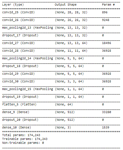
Let's say you built a CNN-based model as follows:

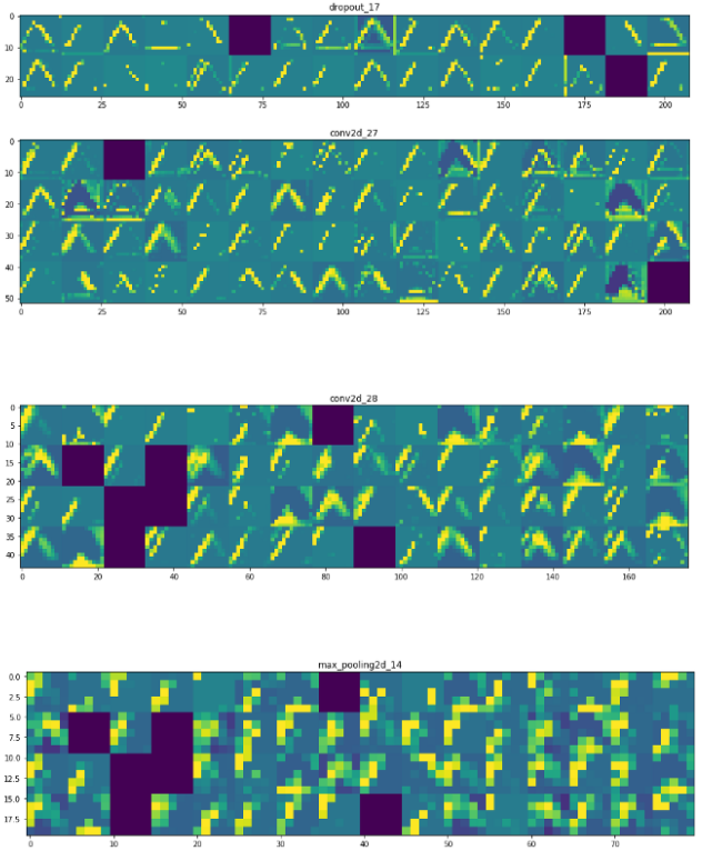
Then, you can get the activation output from the first conv layer. Note that the corresponding output size is $28 \times 28$ with $32$ channels. Then, we can visualize 32 activation outputs as follows:

We can do the same thing for other layers as well:


Since the image size gets reduced over layers, the size of the former activation outputs is larger than the latter. Hence, the first layer's output activations can show the almost entire shape of the triangle. As we go deeper in the layers, the activations become increasingly abstract and less visually interpretable.
References
[1] Gabriel Pierobon, "Visualizing intermediate activation in Convolutional Neural Networks with Keras" (link)
[2] Jason Brownlee, "How to Visualize Filters and Feature Maps in Convolutional Neural Networks" (link)2. Visualization of a Representative Image/Pattern that a Certain Kernel is Highly Actived by. [3]
There are two main ways to try to understand how a neural network recognizes a certain pattern. If you want to know what kind of pattern significantly activates a certain feature map, you could 1) either try to find images in a dataset that result in a high average activation of this feature map, or 2) you could try to generate such a pattern by optimizing the pixel values in a randomly-initialized 2x2 matrix (Erhabn et al., 2009). Since the first approach is self-explanatory, the second approach is explained here.
The idea is the following: we start with a picture containing random pixels. We apply the network in evaluation mode to this random image, calculate the average activation of a certain feature map in a certain layer from which we then compute the gradients with respect to the input image pixel values. Knowing the gradients for the pixel values we then proceed to update the pixel values in a way that maximizes the average activation of the chosen feature map.
I know that this might sound confusing so let’s explain it again in different words: The network weights are fixed, the network will not be trained, and we try to find an image that maximizes the average activation of a certain feature map by performing gradient descent optimization on the pixel values.
This technique is also used for neural style transfer.
In order to implement this we will need:
- A random image to start with
- A pre-trained network in evaluation mode
- A nice way to access the resulting activations of any hidden layer we are interested in
- A loss function to compute the gradients and an optimizer to update the pixel values
Example
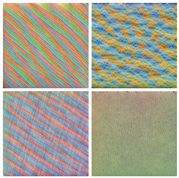
You probably heard of latter kernels capturing higher-level information. This is the kind of visualization that shows it.


(Left) Layer 7, (Middle) Layer 14, (Right) Layer 20 

(Left) Layer 30, (Right) Layer 40 Reference
[3] Fabio M. Graetz, 2019, "How to visualize convolutional features in 40 lines of code" (link)'Data > Machine learning' 카테고리의 다른 글
Log-bilinear Language Model (0) 2021.04.20 What does .eval() do in PyTorch? (0) 2021.04.14 Git Tips (0) 2021.04.05